Cultivating New Frontiers in Agriculture (CNFA) is a nonprofit organization dedicated to enhancing agricultural economies in developing regions. When I joined the marketing team, they were in the midst of a complete website redesign and sought to update their brand to reflect elements of the new site and guide its final appearance.
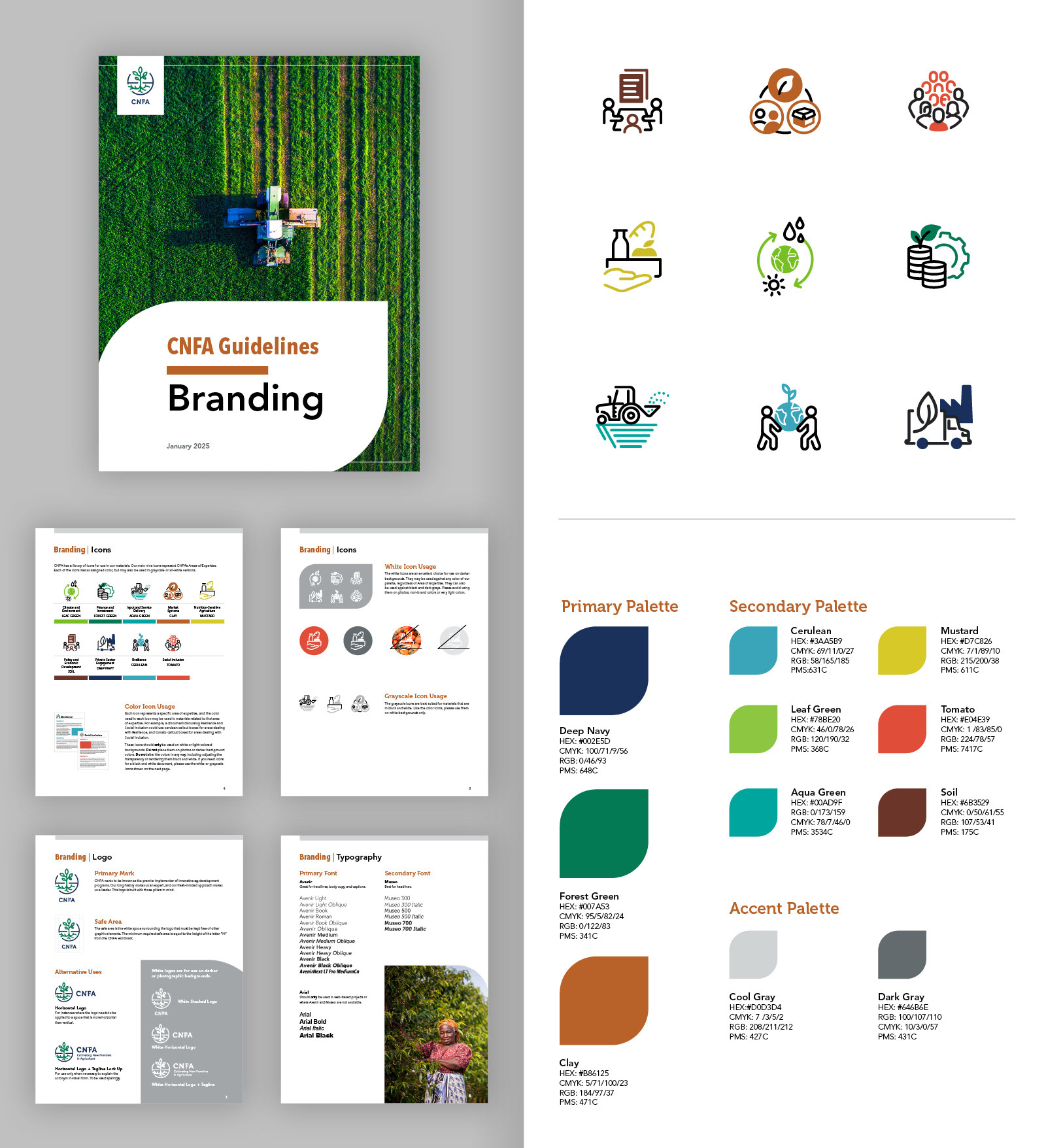
My first step was to develop a refreshed color palette. While specific colors — deep navy, forest green, and clay — were integral to the existing brand, I introduced a playful secondary palette to enliven these deeper shades, along with subtle neutral accents. The neutral colors are especially suited for backgrounds or larger areas where stronger colors might feel overwhelming.
The second step focused on imagery. A primary requirement for the new website was a fresh set of icons to represent CNFA’s areas of expertise. I created a unique suite of icons for each of the nine expertise areas, assigning a specific color from the palette to each icon. These color designations will not only be used on the website. They will also be featured in proposals, information sheets, and other materials to help identify the focus areas in the text easily.
After months of rebranding efforts, everything was finalized and approved. I created a PDF guideline for our branding, detailing everything from logo usage and color palettes to specific typography. This guideline is intended for our internal marketing and proposal teams, as well as for freelance designers we retain and the government agencies, NGOs, and nonprofits we collaborate with.