After a decade of working for Promontory Financial Group, I have overseen many changes to the branding. Beginning as a highly-respected consultancy firm for financial institutions and acquired by IBM in 2016, there have been several name and organizational shifts. I updated the logo in 2016 and 2018 to reflect new roles within IBM.
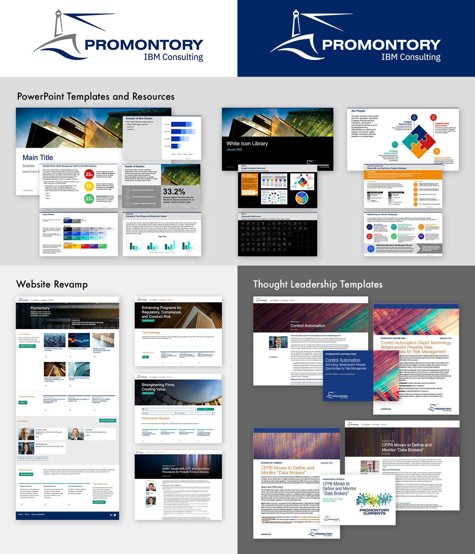
As Promontory staff began to team up with IBM colleagues on cobranded PowerPoint decks, it became vital that we overhaul our PFG-branded PPT templates to better integrate with IBM’s branding. I freshened up the layout with more whitespace and introduced a new, brighter color palette that is unique to the firm but coordinates well with IBM’s modern, blue-based color usage. In addition to a basic template in differing ratio sizes, I made decks with prefilled content and an extensive library of icons and line illustrations, making life easier for non-designer users of our materials.
Of course, no rebranding is complete without a website revamp. As part of this, I created the site’s initial look, made annotated mockups for the development team, and assisted in writing the website style guide. Once again, we concentrated on large areas of whitespace, limited but meaningful use of color, and clean blocks of text highlighted with colorful, textured photography.
Thought leadership articles by our subject-matter experts are essential to PFG’s marketing efforts. When updating the look of our new website’s article templates, I also coordinated the social media tiles and PDF templates to create a cohesive suite of materials for distribution to clients or colleagues.